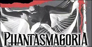
My favorite:
The implied motion and the bleakness given by the white wash effect really do it for me on this one, though I can do without the miniature SH2 and 3 covers and the big gaudy title on top.
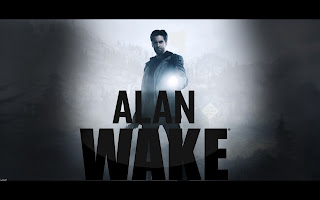
Yeoung's favorite:
I have always liked the Alan Wake cover, though I think this one may be a custom-made one; I found it through Google images so it's possible I accidentally pinched somebody's work. Sorry! If this is yours, say so.
The logo is awesome as always and the nice canopy of trees on top lends itself well to the effect.
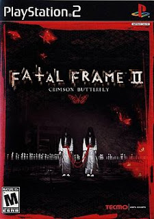
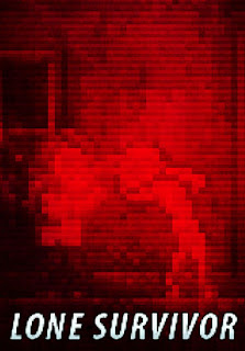
Some good ones:
Most of these are fairly minimalist, single-subject, have clean titles and often use high contrast effects to give a feeling of obscurity or bleakness, which is something I appreciate and would like to invoke with our cover.
Some bad ones:
I disliked these ones for a variety of reasons, whether it be painfully bad or campy art (Fatal Frame 1), too much in-your-face horror (Deadly Premonition), or just for trying entirely too hard (all of the Dexter covers). The Dexter ones in particular are either entirely too stark, evoking "bestseller bait" to me, or look cheap and pulpy.










moral of the story: brian has a massive boner for silent hill
ReplyDeleteAnd I have NO SHAME ABOUT IT.
ReplyDelete